


Letter 12 - 2023
First Sentences, Total Art, and the Architecture of Type

Dear Friend,
You’re getting this message because at some point you signed-up on my Twitter Medium LinkedIn or Insta. There are three sections: Story, Art, and Design.
STORY
How to write a first sentence. I’ve always loved the idea of a great first sentence. I open books in bookstores and read that all-important first line, and well, usually it works and I’m invested and now must buy the book and see how it ends for the story (and for me). We read to transform ourselves, even if we pretend we’re just doing it for fun or because someone mentioned it was interesting. We hope for positive change… that somehow the book will change us for the better. I started to dig into what makes a great first sentence, how it opens the door, sets the stakes, triggers your curiosity, and gives you a reason to care. So how do you write one? I wrote a medium post that offers three techniques (with examples) to set you down the path of inventing a marvelous first sentence. I hope you enjoy it.
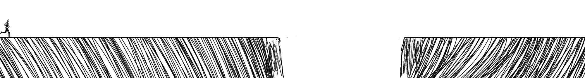
Here’s a preview: the first technique is the Run-Up. In this technique, you just start writing any way you can. You build as you go and warm up as you write and then finally, when you have enough power and momentum you burst through the dullness of mediocre work and write a transcendent moment we’ll always remember. Then—and this is the truly important part—you go back and cut all the warm-up and build-up and have the reader start at the moment you were at your most interesting. I wanted to animate that idea, so made this small gif. The gap in the road is what makes it all worthwhile for me. We see the gap waiting for the runner. What will happen? It’s impossibly far, and yet? And yet this is what a great first sentence does for us, it takes us across that same impossible lacuna that separates our hope from our doubt.
ART
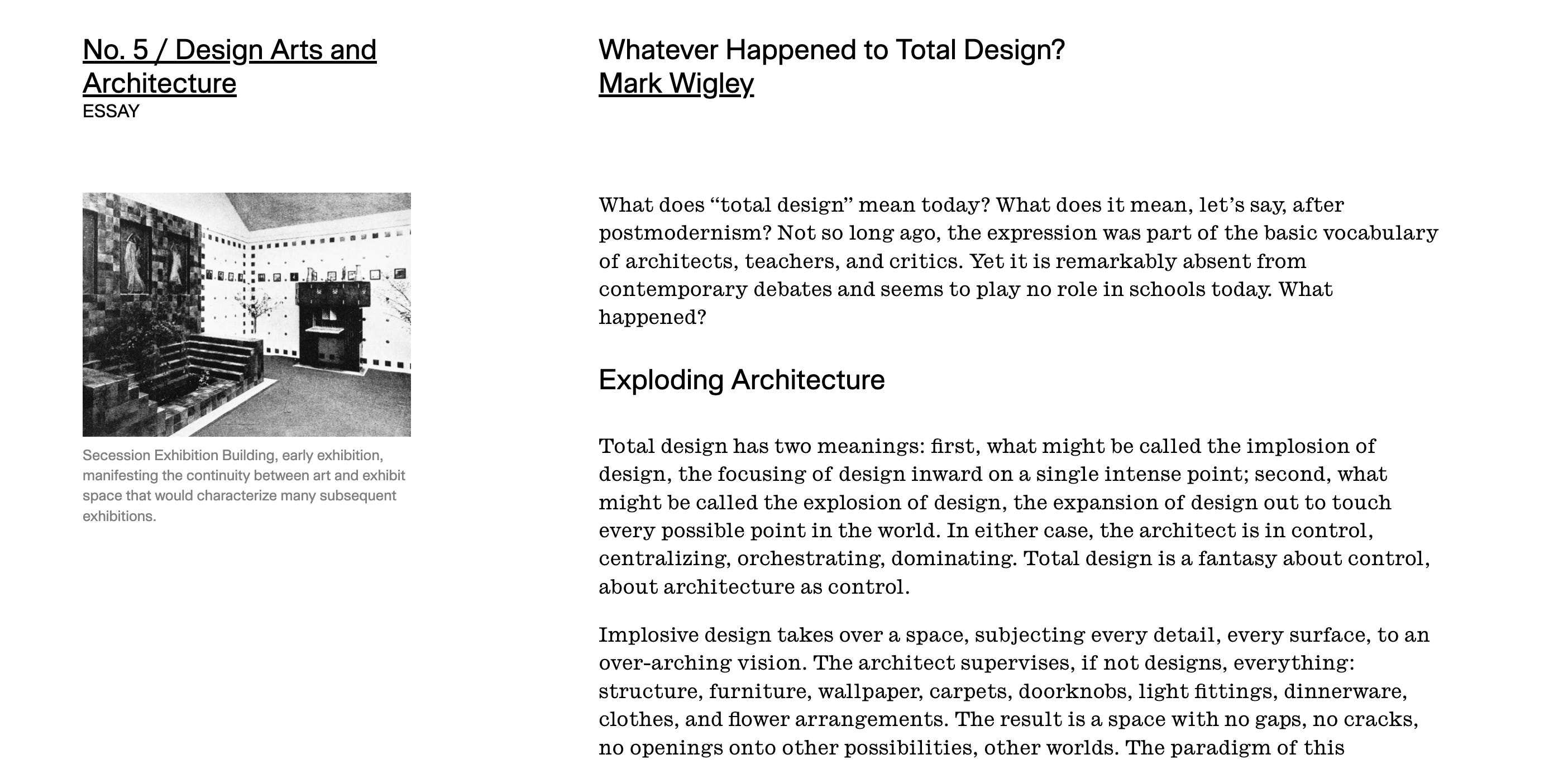
I had a great conversation last week about total art and design. Usually, the term refers to an attempt to control an environment: to design everything. Our best examples come from architecture, where the architect might attempt to design the building, furniture, clothes, and cutlery of the intended inhabitants. Mark Wigley offers his take in Harvard Design magazine.
I like this approach just fine, but my interests are closer to the hopes of opera and ballet where the audience has a total experience. That was the goal of Sensorium at SFBallet, which we called “an evening of total art and design” and well, it’s also the hope of every ballet project I’ve helped create.
What is new for me, different from either the total design of architects of the total art and design of theatre, however, is the idea that an essential aspect of your work might transmute from one form to another through extensions and iterations of a project. Like how a musical motif might reappear overtime, and how we might take our own work and reincarnate it through an on-going series of new projects, new instantiations, new attempts...
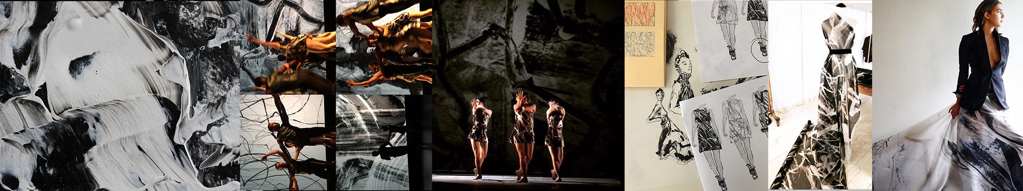
For example, for Homeward at LA Dance Project, I created 180 paintings that I turned into an animated video projection for a ballet, and then took one of the paintings and transferred it to satin organza to create the costumes, and then took the fabric and collaborated with another designer to extend the project into fashion. The idea (the act of the stroke, the mark, the music, the movement and the moment) was transmuted each time, and each time it both changed and remained.
Why do I bring this up? I love the idea that your actual art-ideas (the essential, immutable, beautiful Agalma of your idea) might yet also transmute and appear in different disguises and embodiments in all your endeavors. Side Note: I mean “agalma” in the sense of how it’s used in Plato’s Symposium (a type of tur-duck-en of a story where Plato is the author, but he’s writing as though he’s speaking as Socrates giving a speech to someone else). Agalma usually means a small object, like a carved statue or trinket, that is given as an offering to a god, but Plato-as-Socrates used the word as a metaphor for the essential, true beauty inside of us—that precious most beautiful thing that is our essential selves.
DESIGN
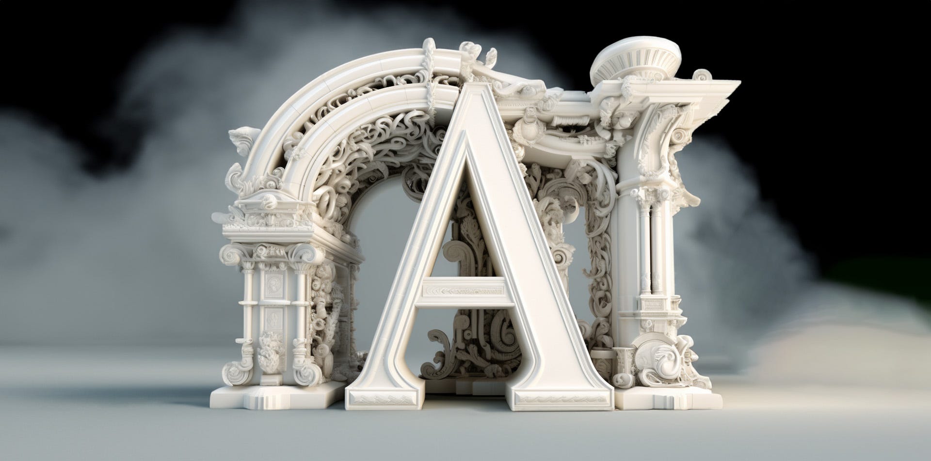
Spend a few minutes with me and I’ll probably mention something I’m thinking about that happened 500 years ago. Recently, I’ve been tracking down that moment when written text became print and the art, science, chaos, cunning, and rapture that went into those pivotal early decisions. Designers will tell you that type is architecture in miniature, but I hadn’t realized before how direct the connection was. How first Vitruvius based his ideas for the ideal proportions of buildings on the ratios of parts of the human body. If you have not read his 10-volume treatise on architecture, you at least know the drawing Leonardo made 1460 years later to finally test it all out. What I didn’t know was that the early typographers were quite interested in elevating their art to the status of architecture and so borrowed both theory and techniques to try to cement the similarities. Roman Gothic letterforms were revived, but this time were inscribed with Vitruvian circles and squares. French type designers included convoluted math with their designs, even as they mostly were designing visually, not geometrically. Architecture’s need to taper columns to create the visual illusion of being completely straight was brought to type in reverse: we must thin, bend, and warp strokes to make type appear to be straight, equal, balanced, and true. Every student of type has that same first moment of recognition when mathematically equal is at odds with perceptually equal. To make elements appear equal, everything is touched and adjusted. Hoefler&Co created a marvelous collection of the most important examples for the Netflix Series Abstract. Find the examples online here.

The difference between “exact center” and “perceived center” matters very much in design… but the office-worker who cracks open Google Slides has never had that mind-melting experience and so simply centers everything bang in the middle, and then can’t figure out why his or her design looks slow, heavy, uninspired, desperate (yet undeserving), insecure, and tired. The idea that it should be slightly up and to the left just a touch would be met with the totally correct and rational reply “but that’s off-center.” And yet being wrong to be right is exactly what’s left.